Follow the steps below using your Pixlr E account to achieve similar result. In the process, you are going to learn the following:
- Masking
- Blend Modes
- Merging layers
Step 1: Prepare two rough wall textures
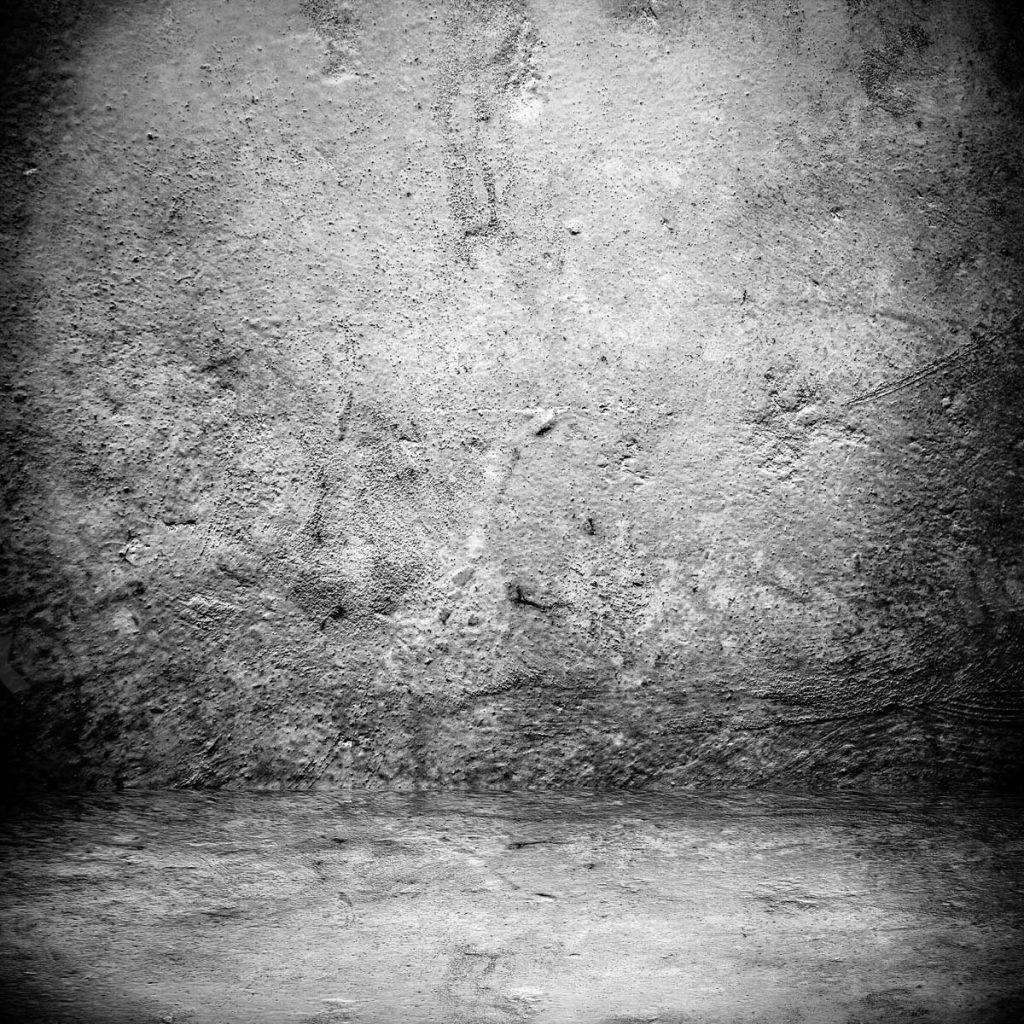
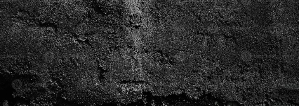
One texture should be darker. We will use this as the background of the design. The other must be brighter. We will use this as the texture of the text. We need contrast between the background and the text, hence, the darker and brighter wall textures.
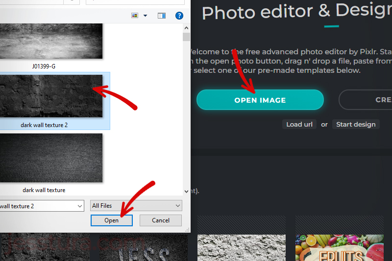
Step 2: Use the Dark Image texture to Open a new file on Pixlr E
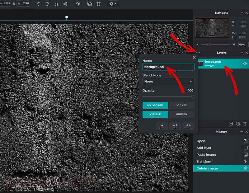
After logging in to your account in Pixlr E, open the dark image texture file.
Name the layer to ‘background’. The three dots in the Layers panel is the key here.
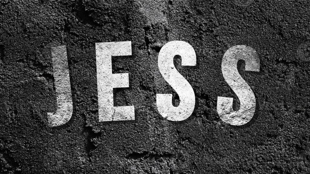
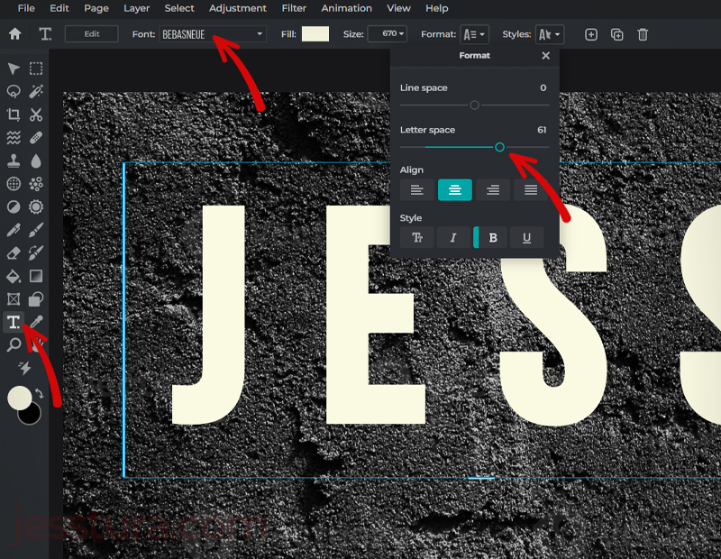
Step 3: Type the text
Use your name or type the text you want. Use bold and thick font style because we are going to fill this text with an image texture later on (the brighter texture image). Make your text big as seen below and color it with white or any brighter color.
I also apply Letter Spacing so that the letters are not too crowded. We will put a Shadow filter later on so spacing between letters will help. I also apply a little bit of Arc Curve which can be set under Styles.
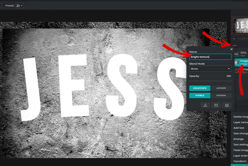
Step 4: Insert the brighter image texture
Insert now the brighter image texture. You can do Copy image from the Google Search, then go to your Pixlr E and do Ctrl+V (paste). Resize your bright texture image so that it will cover all your texts.
Place this just behind the text (or below the text layer in the Layer Panel). Rename this layer to ‘bright texture’. Please note that the text layer should be the topmost layer as of now, and the bright texture is just below it.
Step 5: Apply the bright texture image to the texts
With the text layer selected, click the three dots in the Layers panel, then select Mask for the Blend Mode, then click Merge Down.
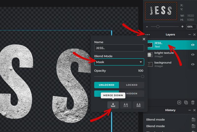
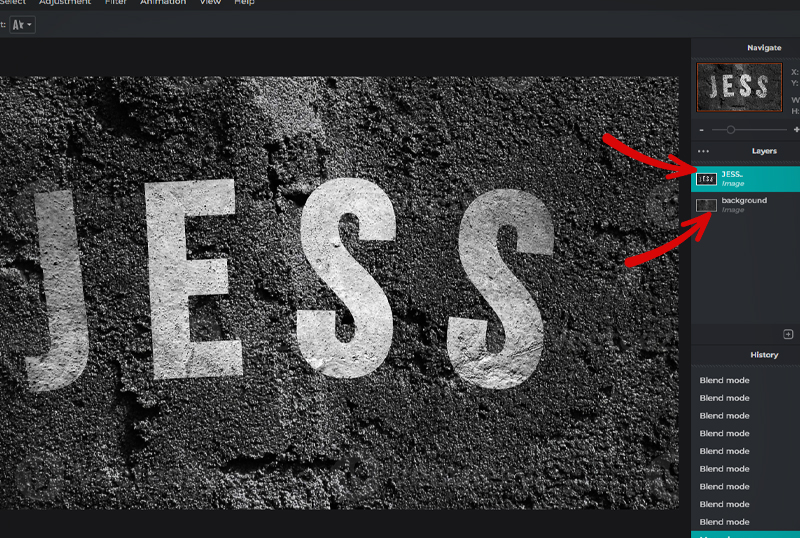
You should have two layers by now.
Step 6: Apply more contrast to the text
Do Ctrl+D to duplicate the layer with the text (it is now actually an image, but we will call it a text anyway since it looks like the text we wrote earlier). Alternatively, you may also click the duplicate button in the Layers panel.
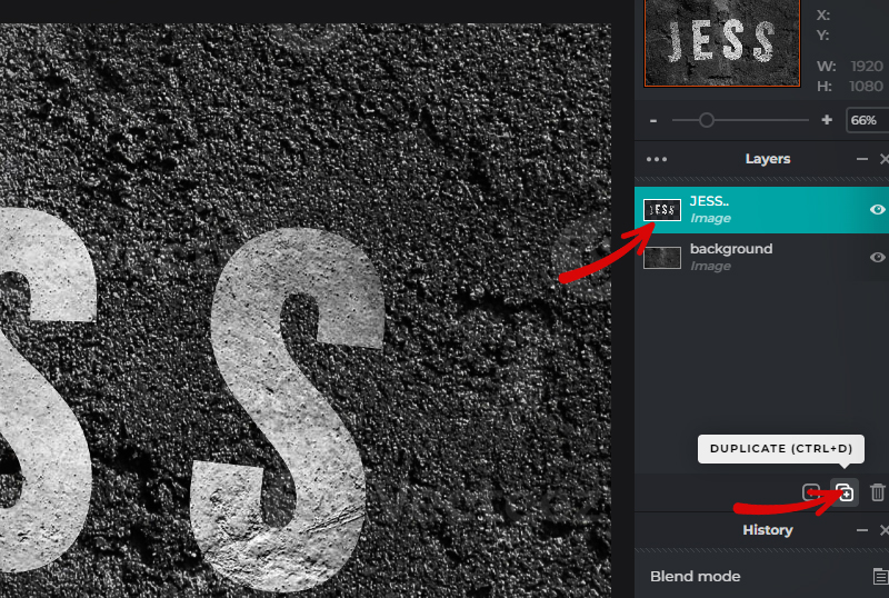
You should have three layers by now.
With the duplicated layer still selected, apply either Multiply or Hard Light or any Blend Mode that will make your texts look more grungy (more contrast).
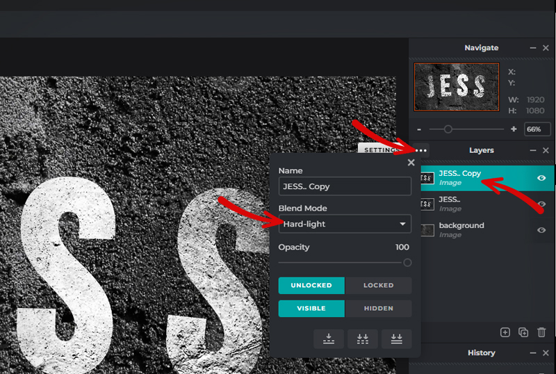
You may want to repeat Step 6 to play around with Blend Modes and see how it will affect your design.
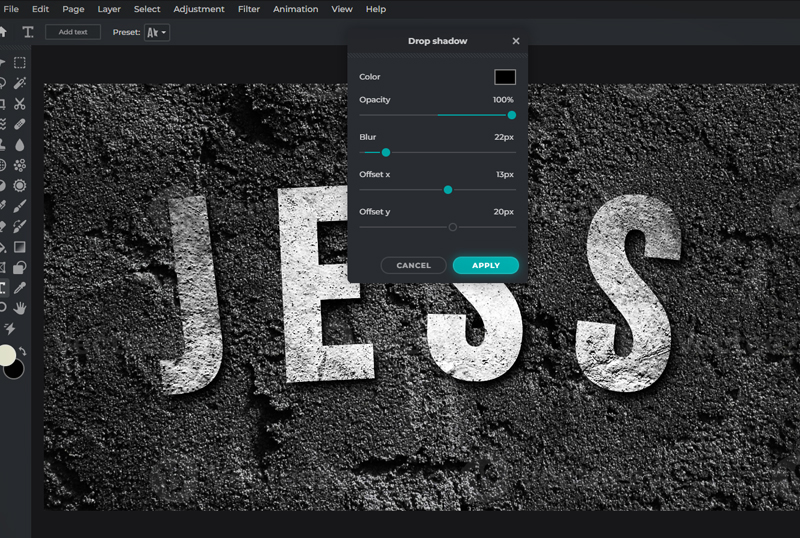
Step 7: Add A Drop Shadow filter
Select the first text-image layer (the one just above the background layer), then go to Filter > Drop Shadow.
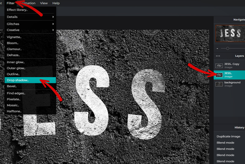
Play around with the Drop Shadow settings until you get the shadow you desired.
That’s all! Congratulations!